The do’s and don’ts of MMS marketing

MMS opened a new realm of possibilities for mobile marketing, allowing us to channel our creativity and bring the senses alive with colour, sound, and movement. With much to offer when compared to SMS, it’s well worth considering for your marketing strategy.
Before you unleash your inner Picasso, check out the following examples to learn about what to do and what to avoid to help you save time and money.
The Do’s of MMS marketing
Learn the fundamentals of MMS marketing campaigns
MMS adds a Hollywood glamour to your message that will put your campaign performance in the spotlight. Here are our top three tips:
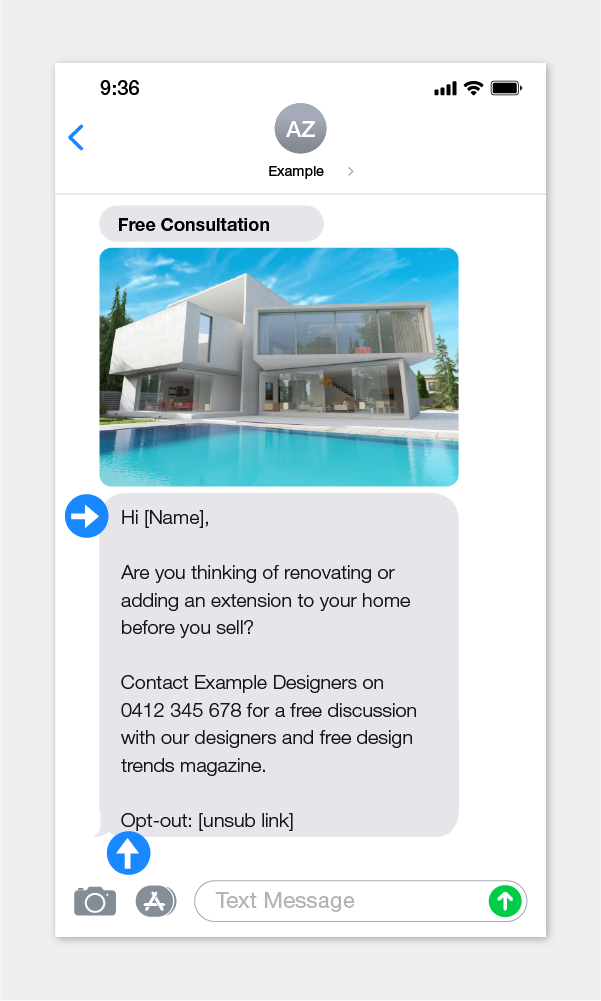
- Personalise your MMS message using their names rather than “Hi there”.
- Insert “Opt-out” or “Unsub” before your unsubscribe link, so the recipient knows what action that link will trigger. You don’t want all your engaged subscribers to accidentally unsubscribe themselves.
- Identify yourself in the body of the message or as the Sender ID

Decide which is the best multimedia file format
Our bulk MMS service is capable of animated GIFs, images, videos, and audio files. Ensure you’ve got the right tools and have considered how different formats can increase the influence of your campaign. For example, a fashion store looking to boost its e-commerce campaign could send either:
- A single image to announce the collection release
- A group of photos from the new season catalog (You can send multiple images so long as they don’t exceed 450kb in total)
- An animated GIF file that cycles through catalog images
- A 15 second video, with or without sound
What works best is dependent on your marketing strategy and message. Unsure? Take time to test two options with a small sample audience and see which engages best. While our MMS platform allows you to send more than one multimedia file at a time, we generally suggest limiting it to two to reduce the length of your MMS.
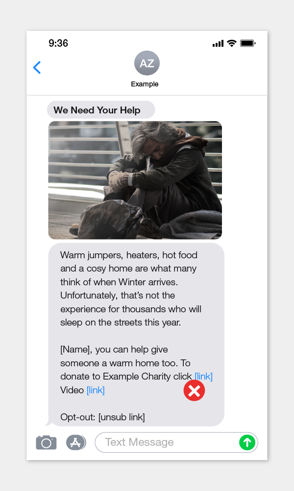
Send a video file rather than a link to a video
In the example below, the company wanted to drive website visits and increase campaign video views. By including both links, they tempted the recipient with two link options. This means they are potentially losing half their traffic to one link.

We suggested that they upload a video in the MMS message in place of their picture. This will ensure all their contacts see their video immediately. They were also able to use one single tracked link to measure their website traffic.
Put the important message front and center
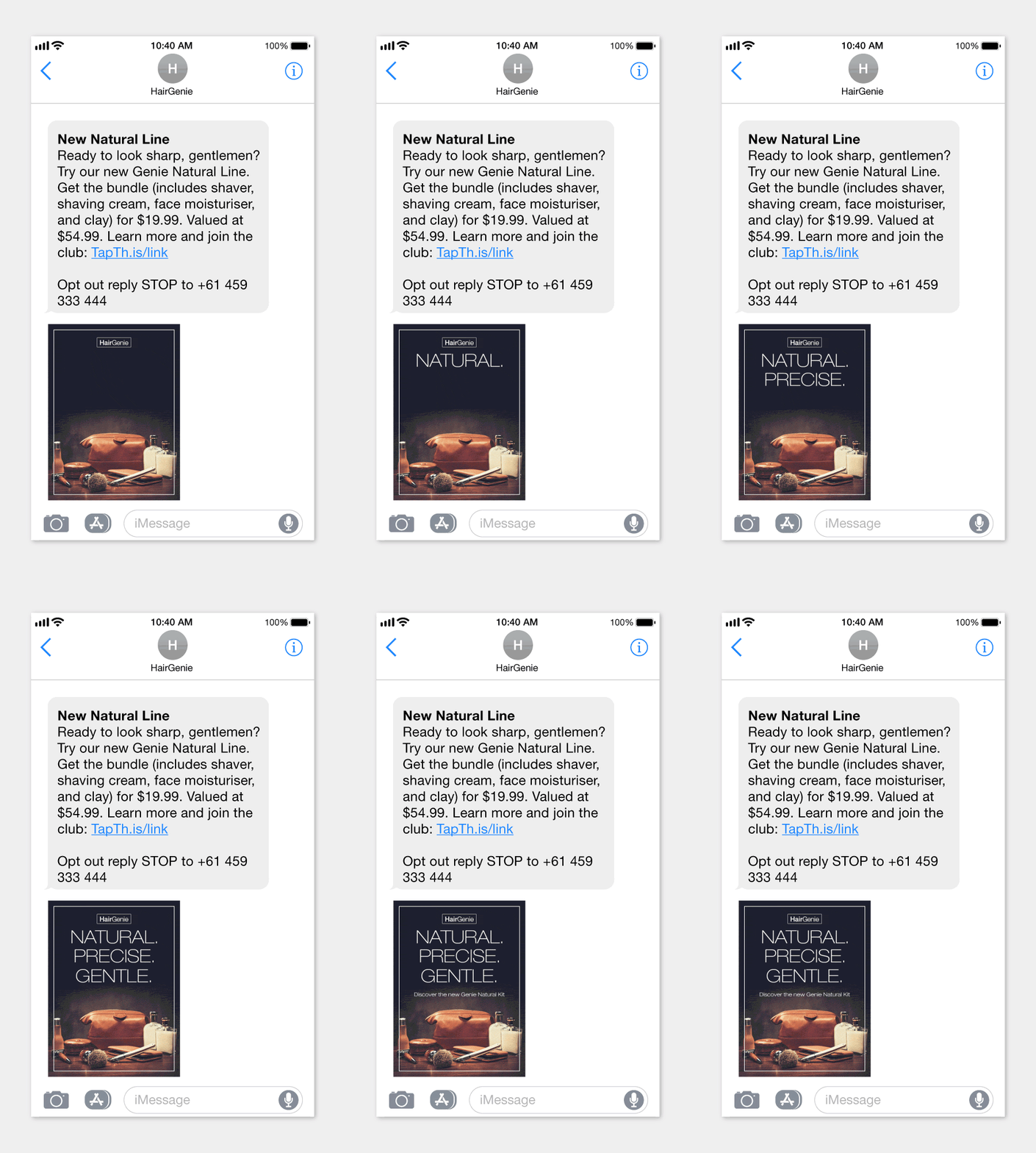
The recipe for a great design is making sure that people see the most important element first. Our eyes naturally see the middle of an image first, and we read left to right. We tend to see bigger elements before smaller ones, and brighter colors stand out more than darker colours.
Take a look at the GIF example below. Where do your eyes start? We hope you say “the top”.

Use Tracked Links
We occasionally see customers including their website URL in their message. This common approach means you miss out on valuable statistics that can help you prove your MMS marketing campaign ROI.
Our bulk MMS platform comes with tracked links, which is a nifty feature that allows you to convert your URL into a short, neat link that counts the number of link hits and tells you exactly who tapped on them.
The Don’ts of MMS marketing
Too much detail
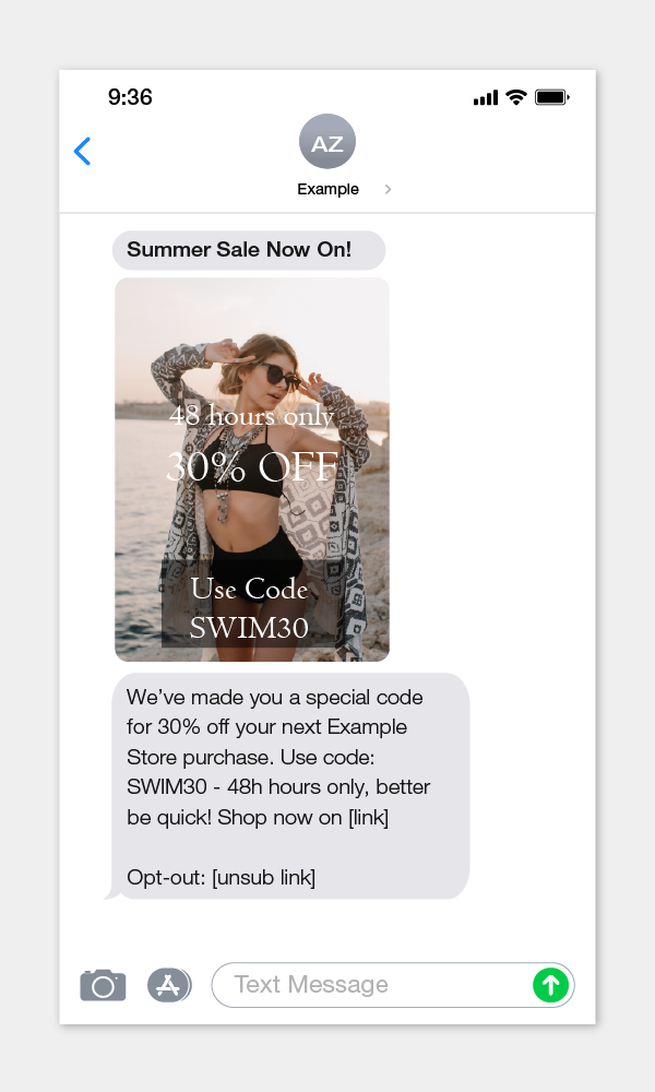
Follow the ‘less is more’ approach. Your MMS multimedia will appear small, so details can easily get lost. When viewing the example below, note how the text is so fine that the ‘48 hours’ is barely legible. A different image, thicker text, or contrasting colours could be used to improve the readability of this image.

Transition too fast or too slow
Speed can convey excitement, but excitement can switch to frustration if the important information swipes by too quickly. Make sure to pause long enough for your readers to absorb it. Alternatively, if your graphic transitions are too slow, your recipient may look away before they see the message. This applies to videos too. You don’t want your text disappearing quicker than it can be absorbed.
Compare the two GIFs below. If you feel you have to wait a moment before the GIF starts or several seconds for it to get to the call-to-action, then it is likely too slow.
 2 second intervals
 4 second intervals
Set the volume too high
Imagine you’re creating a Halloween-themed MMS with a video. You decide to start with a loud, blood-curdling scream that’s reminiscent of a horror movie—it’s Halloween, after all. It will surely grab attention but your recipients may not appreciate it. When your MMS video begins to play, you want to ensure they listen until the end and not rush to turn down the volume.
Skip your test send
Lastly, don’t skip your test send. We can’t emphasise the importance of getting a pair of fresh eyes to test your MMS. You’ll want to be sure that all your hard work pays off. Here’s a quick checklist before you press send.
- Send a test campaign to a friend or colleague for feedback
- Check that your file is optimised to display correctly and at the right size
- See if your text is easy to read
- Check your MMS sound levels
- Compare how it looks on iOS and Android.
- Test to see if your links work- if you’ve added UTM tags then check that they’re tracking correctly in Google Analytics
- Read the text carefully, and check for grammar and spelling mistakes
- Ensure your message ends with opt-out instructions to comply with privacy regulations, e.g replying STOP, or clicking an unsubscribe link
- Avoid using third-party websites to shorten your links as these may result in some telecommunications carriers blocking the delivery of your messages
Final Thoughts
Show your draft to a friend and get their feedback. A fresh set of eyes is always valuable, no matter what you’re creating. These tips will help ensure that your MMS packs a punch. If you need any support, please get in touch with one of our messaging experts.


