iOS vs Android: How it affects your SMS and MMS campaigns

SMS and MMS are proven mobile communications tools, which, for the most part, haven’t changed since their inception. Mobile phone technology, on the other hand, has drastically improved over the years.
Screen sizes: then and now
Before smartphones (think of flip and candy-bar style phones), average screen sizes were about 5 centimetres. It’s now at least triple what it was before, with our new Apple or Android devices.
The jump in screen size and new operating systems led us to investigate how your SMS and MMS marketing campaigns may look.
There aren’t any winners or losers in this comparison test, but let’s look at the differences and what you should consider for your SMS and MMS campaigns.
Android and Apple Link Preview Comparison
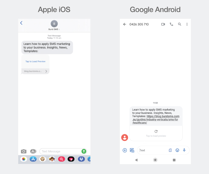
The link preview feature exists for both Apple iOS and Google Android Messages, giving SMS marketing recipients an image, title, and short description of the URL.
Marketers can leverage the link preview’s striking display to create a more persuasive call-to-action (CTA), increasing click-through rates (CTR).
When comparing the two, we noticed that the URL remains on the Android version even with a link preview. A great reminder for marketers is to shorten URLs to save on the character count and making it less of a distraction.
You may want to consider adding a short CTA such as “Learn more” or “Visit here” just before the URL to create a better flow between the copy and the link preview for iOS users since the URL gets omitted.
Apple recently revised the iOS link preview behaviour so that it only displays when the recipient has the sender’s number saved. So by default, the text-based URL will display. There’s a high chance that your iOS audience will no longer see a link preview, but that shouldn’t discourage you since there are plenty of Android users.
To learn more about how SMS link previews works, we invite you to check our recently updated series for Apple iOS and Google Android.
MMS Size & Arrangement Comparison
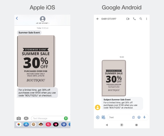
The subject line is an important part of an MMS campaign but is often overlooked. The way iOS and Android display them are different, as shown above.
For iOS, the subject line appears before the image and is unbolded. For Android, it’s the opposite, with a “Subject:” preceding it.
The differences won’t affect how you create your MMS, but knowing this can help you plan your campaign copy more effectively to cater to both platforms.
For example, we recommend that you avoid using the same words for both your body text and subject line, as the appearance looks repetitive and may not flow well for Android users. Finding the right balance is an artform.
Last but not least, the MMS image size is different for both platforms. With iOS, the image takes up about 75% of the screen width, whereas Android takes about 50%.
The 25% difference can make or break your image, especially if it contains text that may be too small to read. Always test your campaign on both devices.
Messaging app’s text preview comparison
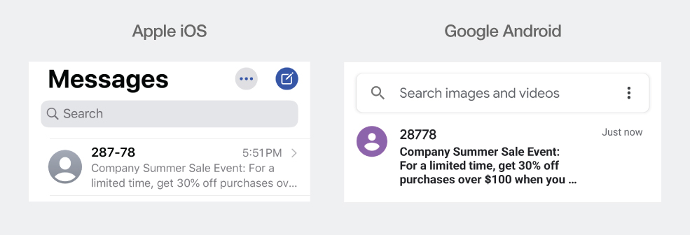
Before opening the text message, you’ll see a preview of the text, which is similar to an email’s preview text before you open it.
iOS and Android cut off the text differently on the notification centre, home screen, and message application itself.
With many variations and customisation options available on Android, notifications can look and appear differently on many devices, so we’ll only compare how the preview appears on the messaging app for both platforms.
For iOS 13, we found that the message preview is limited to about 70 characters. For Android 10, it’s 87.
That’s a 17 character difference between the two or an equivalent of a typical MMS subject line.
You can’t change the number of characters shown on a preview, so you should be mindful of maximising the first 70 characters and getting your point across.
This practice is no different than strategically thinking of a compelling opener for your email marketing campaign or the first 5 seconds of your YouTube advertisement.
Final Thoughts
As SMS marketers, we are continually optimising our messaging to fit within the 160 character limit. With differences between iOS and Android, marketers should always be testing their campaigns on both platforms. The little things add up to make a big difference in the long run.
