Connecting your Google Sheets data to your Data Studio dashboard

Welcome back to our Google Data Studio series where we will take you through the steps to create a simple dashboard to help you visualise your SMS marketing campaigns. If you haven’t read Part 1: The Basics, we recommend you start there before continuing on.
Here in Part 2 of this series, we will show you how to create your first dashboard and how to connect your Burst SMS campaign data to it. Part 3 of this series will teach you how to connect your Google Analytics data, add various controls, and customise your dashboard.
Why create a dashboard
Okay, imagine it’s time for your annual strategy planning session. You’ve heard how SMS boasts a 98% open rate and a 10% click-through rate, so you decide to adopt a SMS marketing strategy.
You decide to run 4-5 campaigns with an online SMS service every month, directing your customers and prospects to your website. Every time you run a campaign, you want to see how your campaign performed, if the campaign converted, and how your traffic did on your website.
To do so, you need to look at your SMS campaign data, Google Analytics data, and potentially more. On top of that, you’re going to want to revisit past campaigns and compare results. This is where a dashboard will help you.
By being able to monitor your SMS campaign and Google Analytics (GA) data all in one place, you’ll be able to easily get a snapshot view of how successful your campaigns are and optimise them to perform even better.
How to create a basic dashboard
Data
First, we need to have some data to connect to the dashboard.
We will set up a Google Sheet to store your SMS campaign data. After running any SMS campaign using Burst SMS, you can export your campaign data and add them to a Google sheet like this:

You can set up your sheet however you want, but ensure you have a header for each column. It’s important that you customise your data sheet in a way that fits with your business’ goals and what you hope to gain insight into.
Once you have your data ready, let’s start building your dashboard!
Adding data to your dashboard
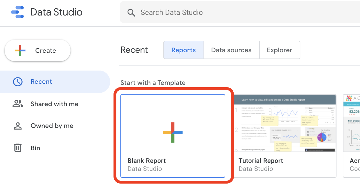
1. Head over to Data Studio and create a Blank Report
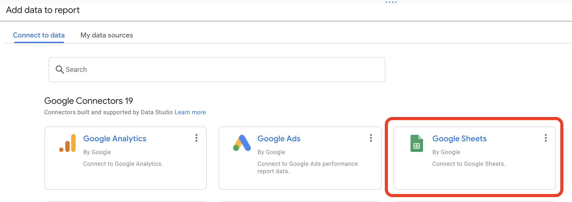
2. When prompted to “Add data to report”, select the Google Sheets connector
3. Select the Google Sheet your data is stored on. In this case, we will add our data sheet “Burst SMS Campaign Data Sample," and then click Add
If your headers are not on your first row, go back to your sheet and add them. Alternatively, you can select a specific range under the Options section.

Google Data Studio will automatically create a table when you add any data source. Simply delete the table and continue with the steps below.
4. Name your dashboard by clicking on the title Untitled Report
5. Add pages and name your reports accordingly
Google Data Studio gives you the option to create different pages on your dashboard, allowing you to separate what you want to view or analyse.
In this case, we will create 2 pages: General Audience Campaigns and Targeted Campaigns:
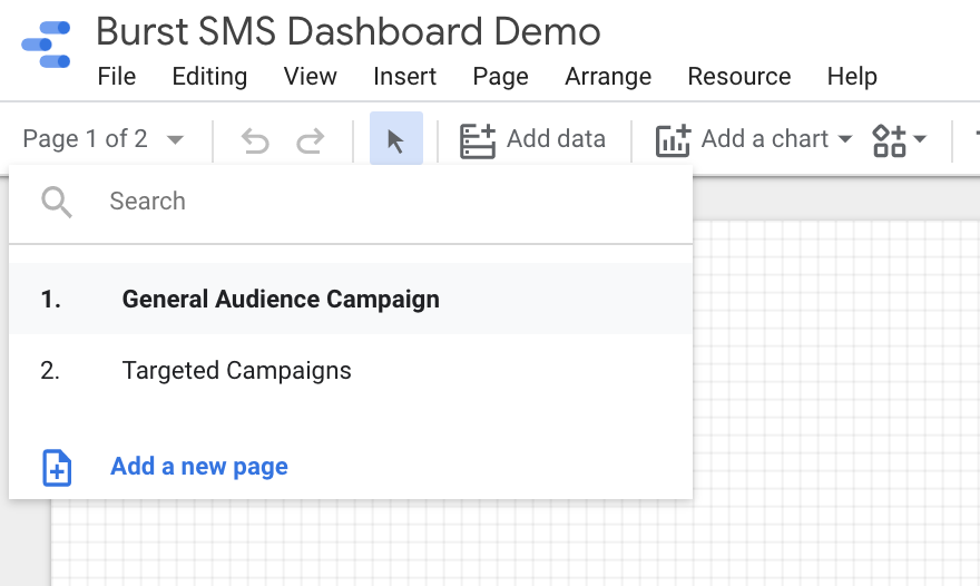
For this tutorial, we will only be building out the General Audience Campaign page. We will leave the second report page in your creative hands!
6. Click Add a chart to add various data visualisation options to your dashboard. Select Total Scorecard and place it anywhere on your dashboard.
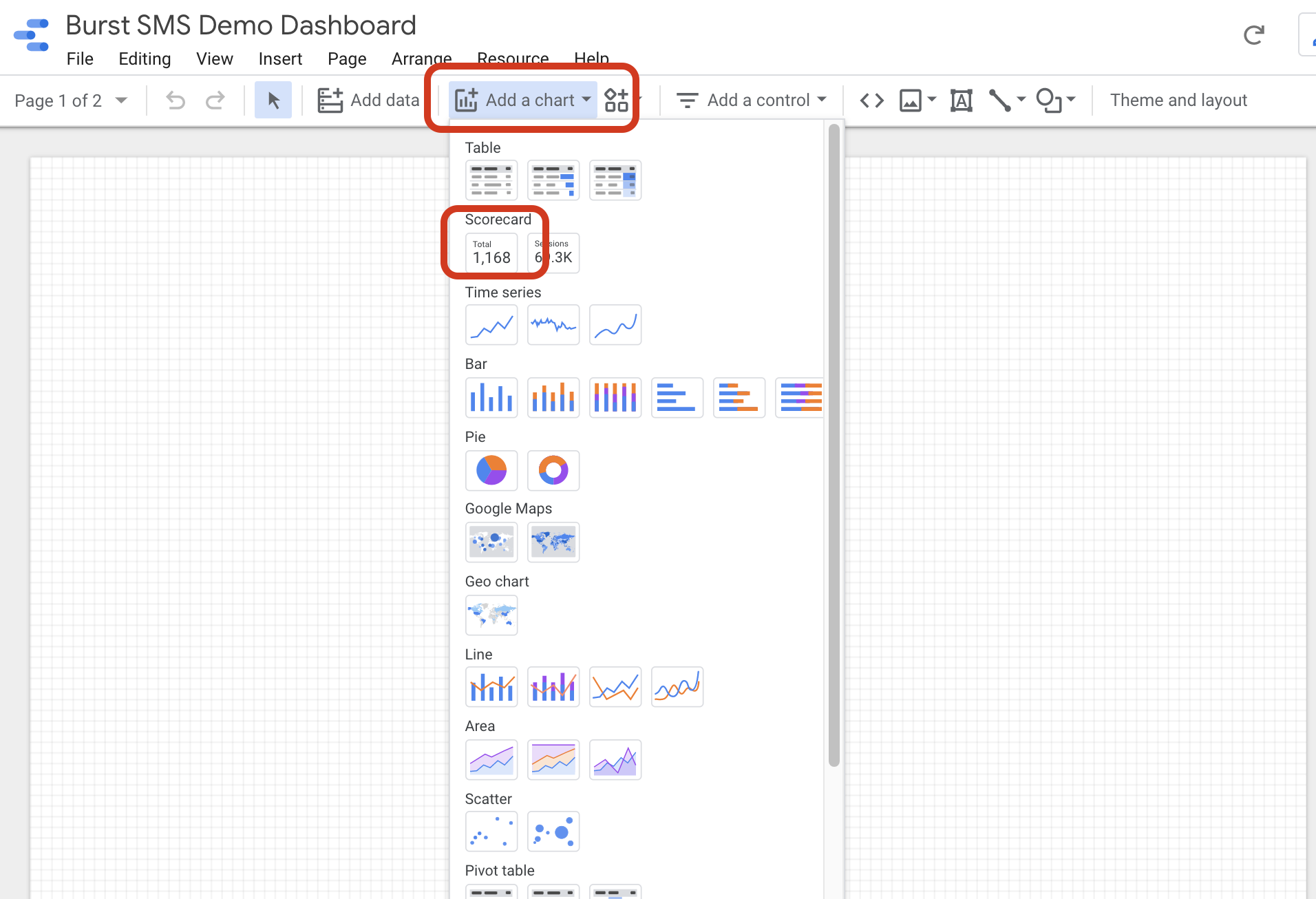
Ensure you have the correct data source selected (Burst SMS Campaign Data Sample). You can change the data source to your Google Sheet data by clicking on the pencil symbol beside the selected data source.
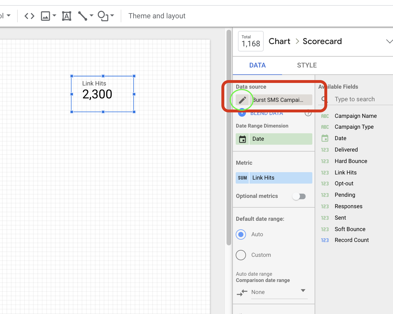
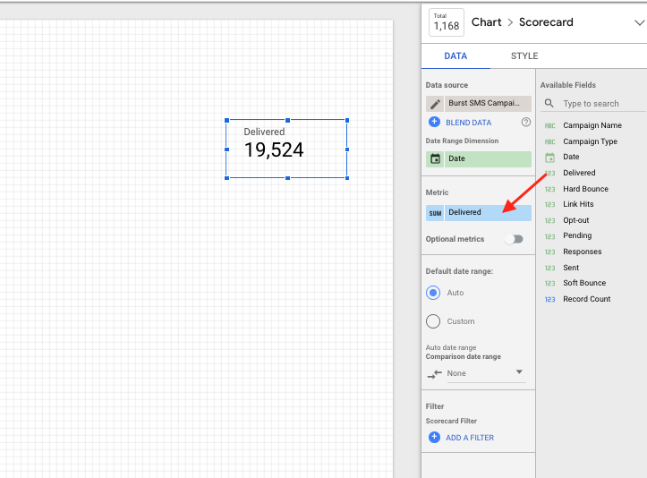
7. Select the metric you want to display by dragging and dropping one of the fields into the Metric section.
In this case we want to see how many SMS were delivered so we will select the “Delivered” field.
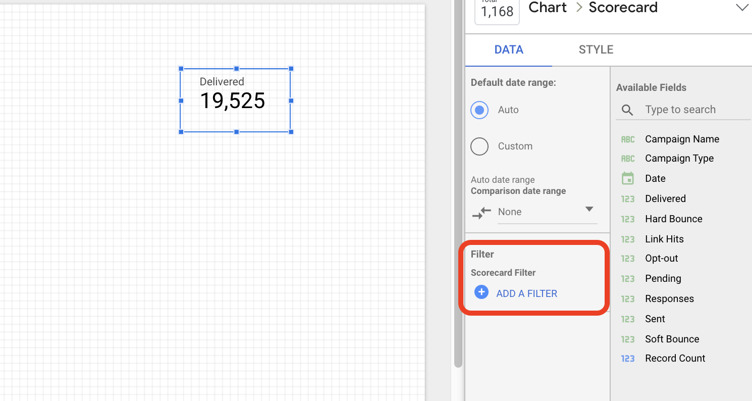
8. Add a filter on the data
You may or may not need to do this depending on your data source and what you’re looking at. In this case, because we are creating a General Audience Campaigns page, we will add a filter to only pull data that is tagged General Audience (GA) on this report.

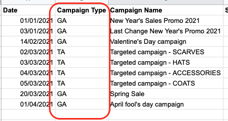
It’s important to note that we have categorised our campaigns in our source data with GA (General Audience) campaigns and TA (Targeted Audience Campaigns), so we can make this distinction on the dashboard.
9. Add a Total Score Card with a calculated metric.
We will be displaying “Click Through Rate” by dividing all “Link Hits” by “Delivered”.
Repeat Step 6 and 7, but instead of dragging one of the fields into the metric section, click the metric and select Create Field.
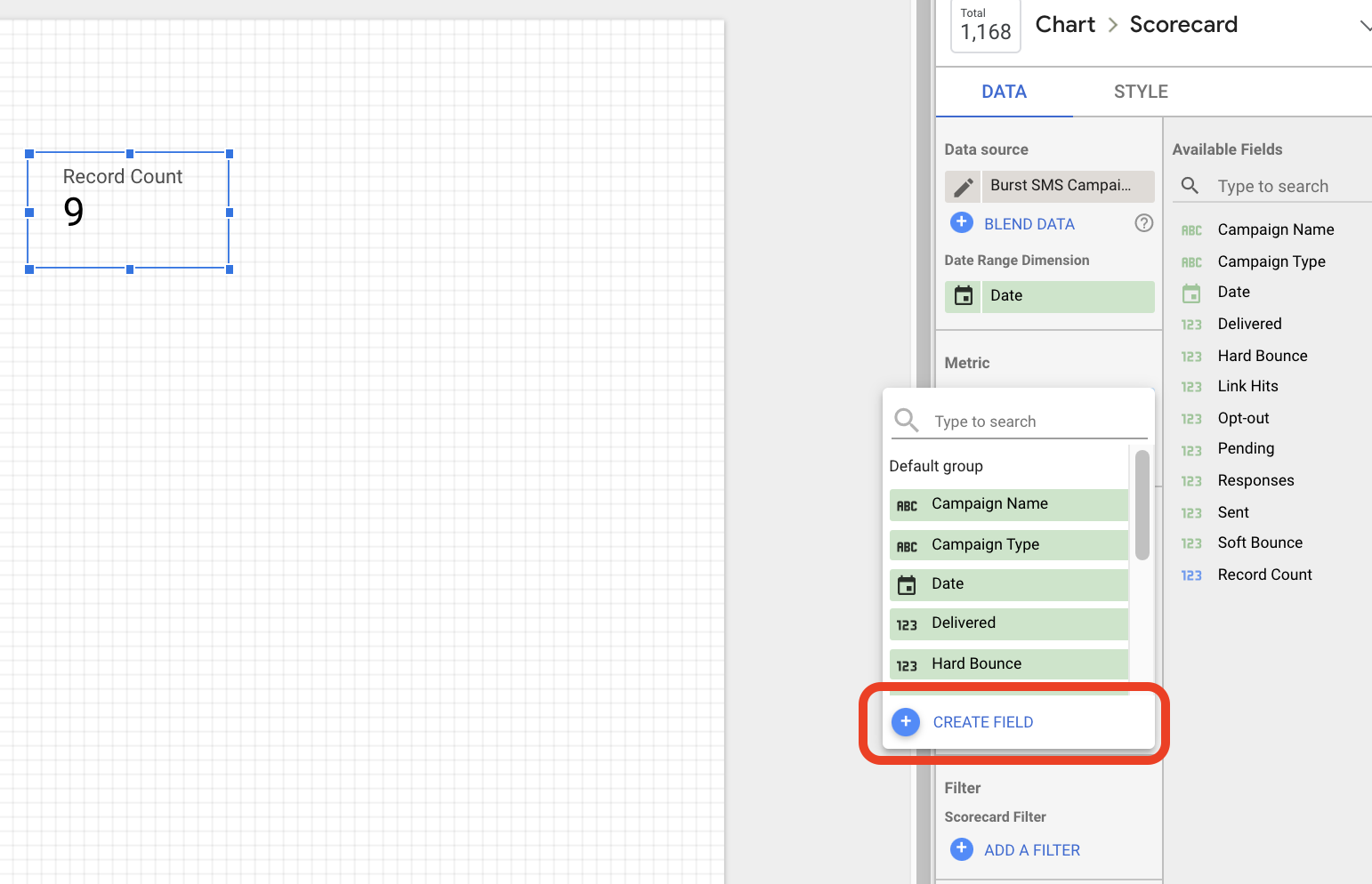
10. Customise your new field with the data you want
- Create a name for your new field. We will name our scorecard “Click Through Rate”
- Add the formula required to calculate click through rate:
- SUM (Link Hits) / SUM (Delivered)
- Change the type of data displayed to “Percent” since we are displaying a rate
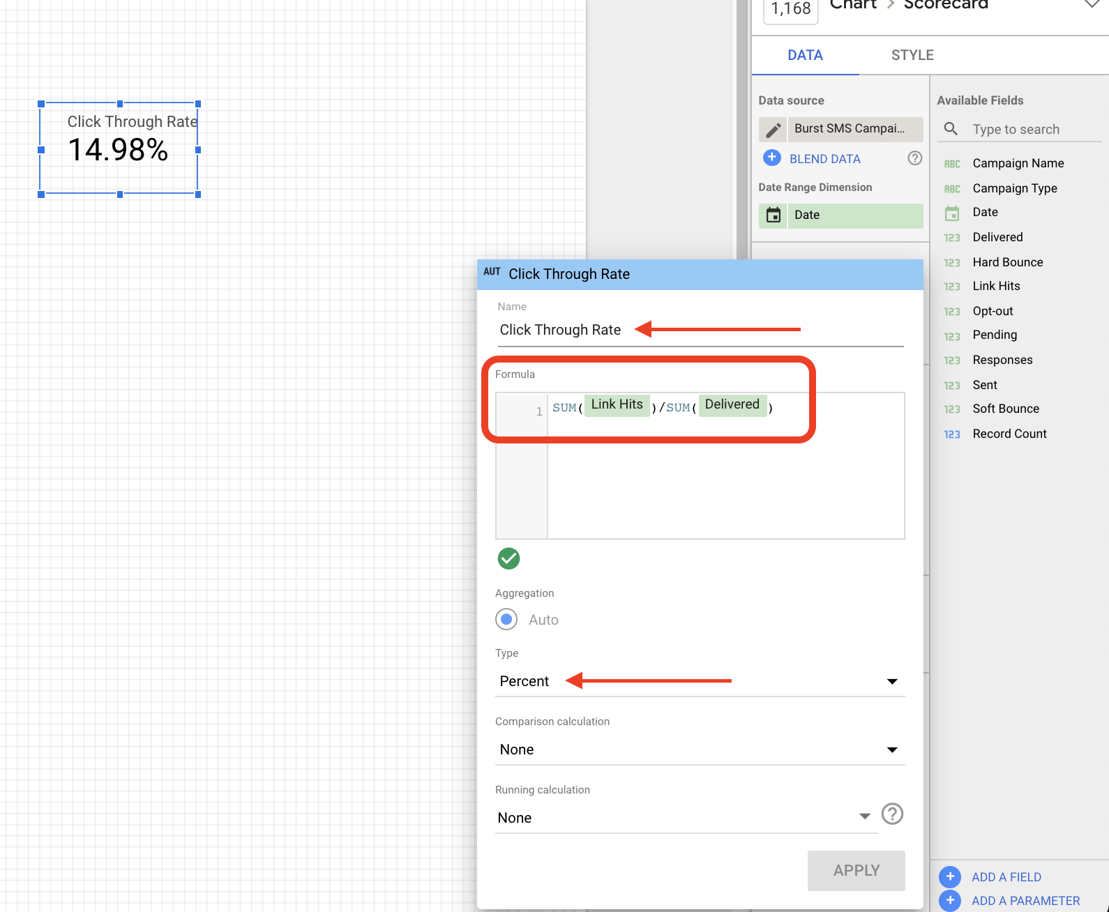
11. Repeat the steps above with all the data you want displayed. For the dashboard we are creating, here is the list of metrics we’ve included:
| Data Source | Chart | Dimension and Metric |
| Google Sheets Data | Scorecard | Delivered |
| Google Sheets Data | Scorecard | Click Through Rate(Link Hits/Delivered) |
| Google Sheets Data | Scorecard | Opt-out Rate(Opt-out/Delivered) |
| Google Sheets Data | Scorecard | Soft Bounce Rate(Soft Bounce/Sent) |
| Google Sheets Data | Scorecard | Not Hard Bounce Rate(Soft Bounce/Sent) |
| Google Sheets Data | Scorecard | Response Rate(Response/Delivered) |
12. Add a title to your report page with a text box and rearrange your scorecards in a way you want them on your dashboard.
We’ve arranged ours like this:
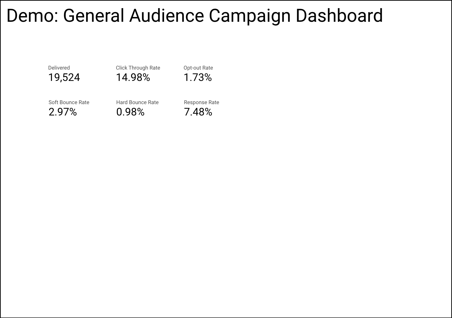
This concludes the end of Part 2 of our Google Data Studio Dashboard series. While it may not look like much now, stay tuned for “Part 3: Connecting your Google Analytics Data”, where we’ll be adding our Google Analytics data and customising the dashboard with controls, colors, and images.


