Connecting your Google Analytics data to your Data Studio dashboard

At last, the final article of our Google Data Studio series! If you haven’t read Part 1: The Basics and Part 2: Connecting your Google Sheets data, we recommend you start there before continuing. The steps below will be a continuation of the dashboard we started building in our previous articles.
In Part 3 of this series, we will be adding Google Analytics data to our previous dashboard and then customising it with controls, colours, and images.
To track your SMS campaigns using Google Analytics (GA), please note that you must have previously utm-tagged your SMS link so that GA can gather data on your web traffic coming from your SMS campaigns.
Connecting your data source
1. Head back to your Google Data Studio Dashboard and click Edit to continue modifying your dashboard
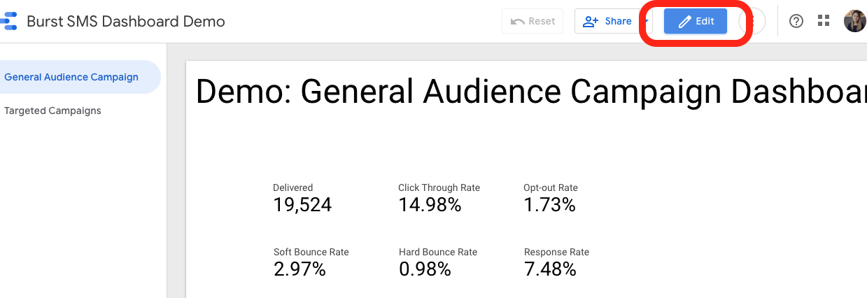
2. Click Add data and select the Google Analytics connector
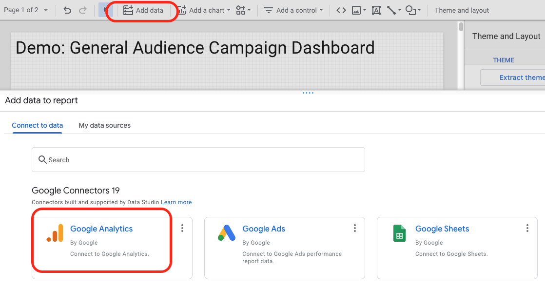
3. Select the appropriate Account, Property, and View you want to connect to your dashboard
Your Account, Property, and View should exist from when you set up your Google Analytics for your website. Keep in mind that it will have a different name than what you see below based on your business.

Once you connect your data source, you’re now ready to add data charts to your dashboard!
Adding data to your dashboard
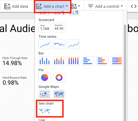
4. Once you connect your data, select Add a chart, pick the type of data you want to display and add it anywhere on your dashboard.
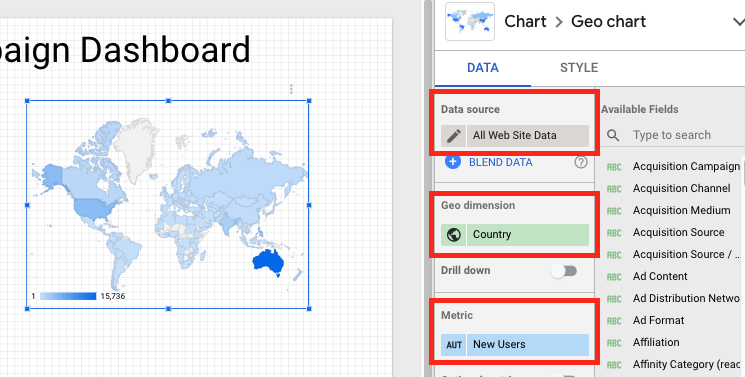
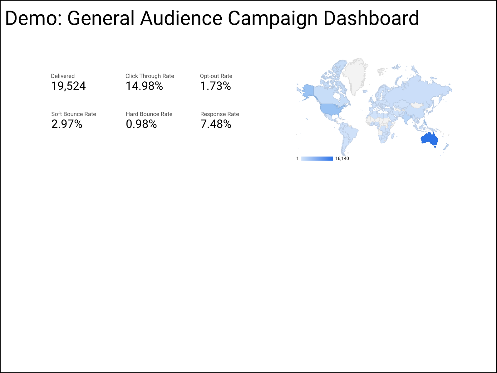
In our example, we will be selecting Geo chart to show where our New Users are coming from.
Ensure you have the correct data source selected (All Web Site Data), and then select Country as your Geo Dimension. Lastly, adjust your metric to ensure you are displaying what you want to see. In this case, we want to look at New Users.
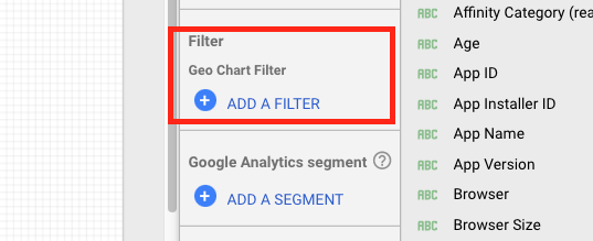
5. Add a filter on your Geo Chart
Similar to Part 2 of our tutorial, we will have to create a filter to pull the data that is relevant to our SMS campaigns. First, click ADD A FILTER and include only campaigns that you have previously utm-tagged for your SMS campaigns.

Your dashboard should now look like this:
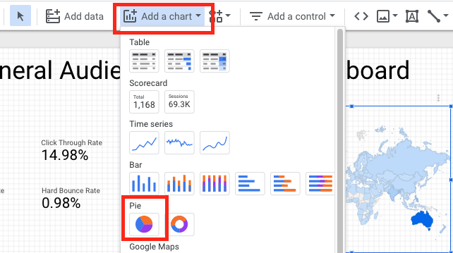
6. Select Add a chart, click the Pie chart and place it anywhere on your dashboard.
We will be creating a graph to see the device category of our users.
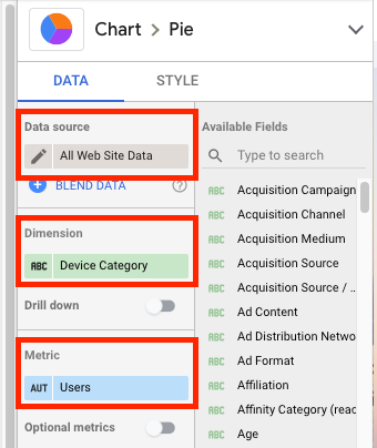
7. Follow step 5 to add the correct filter to your pie graph.
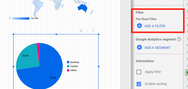

8. Follow steps 6-8 from Part 2: Connecting your Google Sheets data to your Data Studio dashboard to add various Scorecard charts to your dashboard with the Google Analytics data.
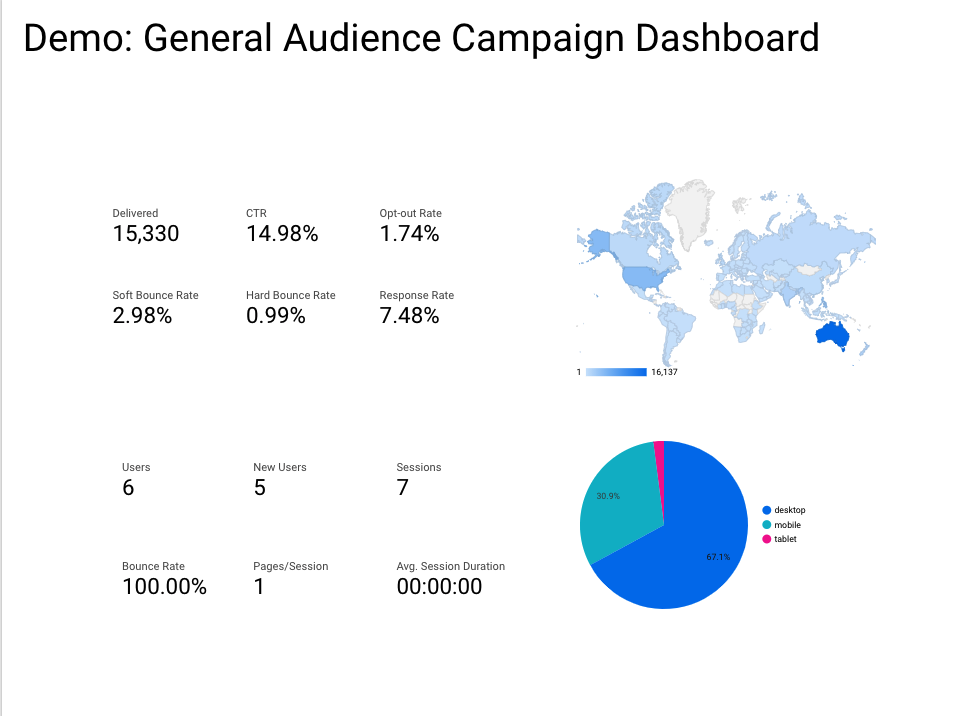
For the dashboard that we are creating, here’s the list of metrics we’ve included:
| Data Source | Chart | Dimension and Metric |
| Google Analytics Data | Scorecard | User |
| Google Analytics Data | Scorecard | New Users |
| Google Analytics Data | Scorecard | Sessions |
| Google Analytics Data | Scorecard | Bounce Rate |
| Google Analytics Data | Scorecard | Pages/Session |
| Google Analytics Data | Scorecard | Avg. Session Duration |
After adding all the Scorecards from above, your dashboard should now look like this:
Adding Controls
Controls allow the viewer of the dashboard to apply specific filters and set different parameter values. The native controls from Data Studio include:
- Drop-down list
- Fixed-size list
- Input box
- Advanced filter
- Slider
- Tickbox
- Date range control
- Data control
In our dashboard, we will only be adding a Data range control, but we recommend playing around with the available options to see what works best for you.
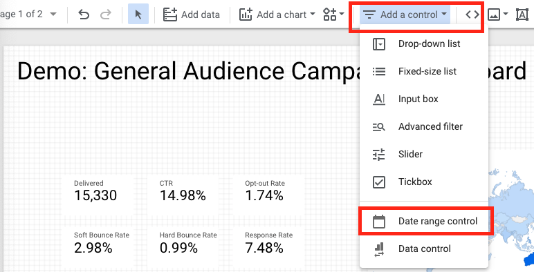
9. Select Add a control in the Data Studio toolbar, click Date range control and place it anywhere on your dashboard.
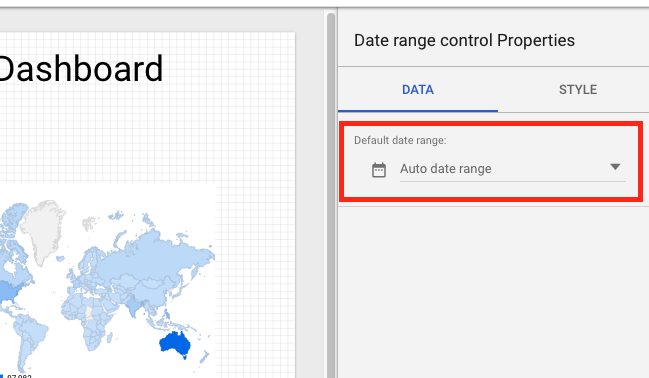
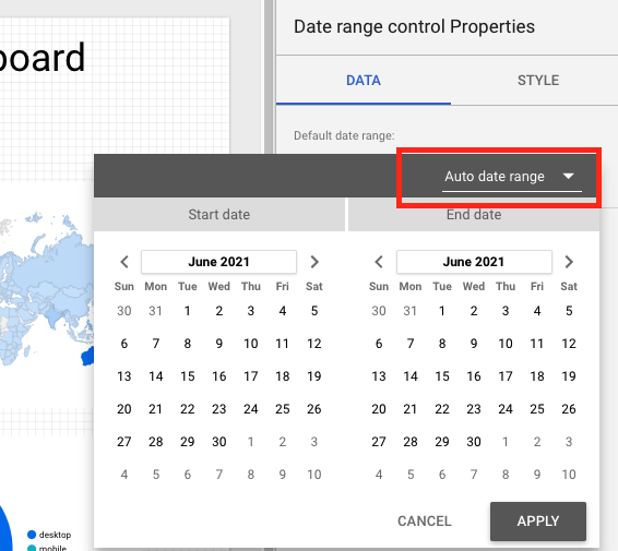
10. Adjust the Date range control Properties on the right side of the dashboard.
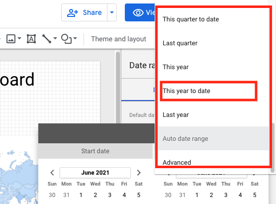
The Default date range is “Auto date range”. Simply click it and adjust the default date range you want to display when the dashboard first loads for a user.
The user will then be able to adjust the date range filter via this control when viewing the dashboard.
Customising your dashboard
Lastly, it’s time to personalise your dashboard with colours, images, and fonts. There is a myriad of options to change the look of your dashboard.
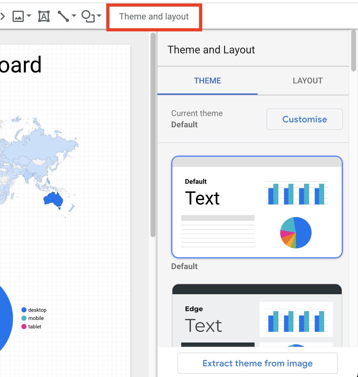
11. Click Theme and Layout on the right side of the Data Studio toolbar
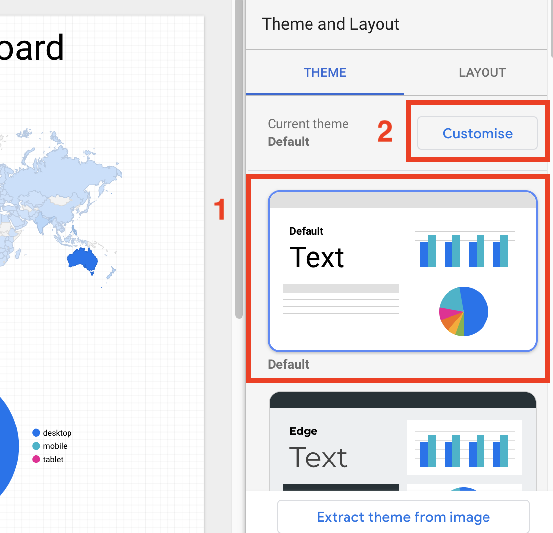
If you’re not interested in personalising the small details, Data studio has several preset themes that you can apply to your dashboard. You can start by clicking on one of the themes you like.
12. Select any one of the themes you like and click Customise
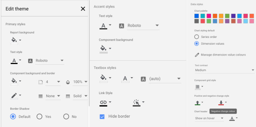
13. Change the background colour of your report by clicking Report Background and select your desired colour.
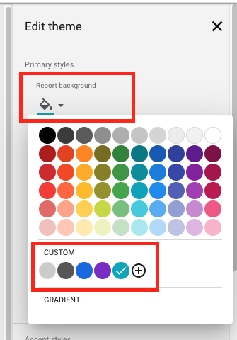
14. Optional: If you’re looking to adjust individual data charts, click the chart and navigate to the Style tab to adjust the style.

15. And at last, we have reached the final form of our dashboard:
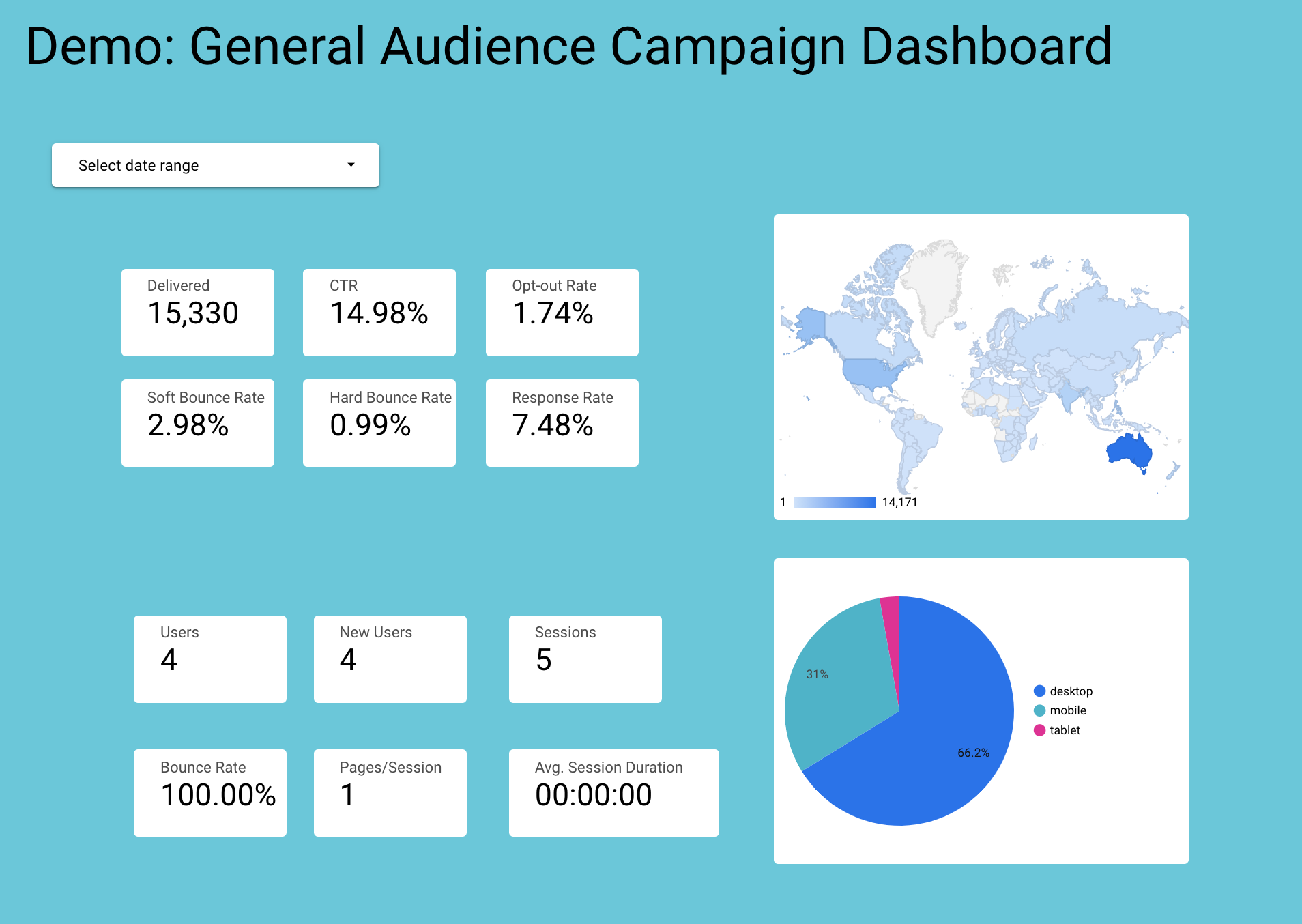
As discussed above, there are many different ways you can personalise your dashboard. Here, we’ve only done a simple background change. However, don’t let your creative juices be limited to just colours: add images, edit fonts, add conditional formatting, and more!
Final Thoughts
And there you have it, the final piece to our Google Data Studio series! We hope that you learned something and that you will adapt Google Data Studio into your tech stack. It’s certainly tough to be an all-around marketer, but hopefully, Google Data Studio can help alleviate some of the challenges when viewing and visualising data.


