Build your own Google Data Studio Dashboard [Part 1: The Basics]
![Build your own Google Data Studio Dashboard [Part 1: The Basics]](/uploads/google-data-studio_1200x600.jpg)
As an all-around marketer, you’re continually trying to balance a dozen things and more. If you’re not working on creating new blog content, then you’re probably developing new email marketing campaigns or working on your search ads and website SEO.
On top of it all, you have to analyse your results from several sources, and then optimise and improve all of your campaigns; it’s not easy.
While it may seem simpler, in the beginning, to navigate 99 different marketing tools to look at and process your data, we’d like to introduce you to Google Data Studio.
In this 3-part series, we’ll teach you the basics of Google Data Studio and help you create a dashboard with your SMS marketing campaign data. We will connect two types of data sources to your dashboard, but first, let’s get started with the basics!
What is Google Data Studio?
Google Data Studio is a free tool that allows you to build reports and visualise your data. It is easy to use and supports live connections to many popular marketing tools and makes for a great alternative to complicated business intelligence or data visualisation tools. You won’t need a developer or data scientist either.
You’ll be able to create different types of data visualisations such as pie charts, pivot tables, plots, and more. A dashboard allows you to get a snapshot view of your campaign or your company; it’s easily shareable and allows you to create reports a lot quicker.
Google Data Studio also integrates extremely well with Google’s existing ecosystem. So if you’re already using Google Workspace (formerly known as G Suite), it’ll be even easier for you to start building your dashboard.
If you’re looking for a more detailed overview of Data Studio, Google offers a great Support Portal with a variety of resources to help you. There are also plenty of community Data Studio report templates in their Report Gallery for you to explore and play around with.
Connecting your data sources
There are 3 ways you can connect your data to Google Data Studio:
- Google Connectors
- Connectors built by Google for Google products and basic functions such as connecting .csv files.
- Partner Connectors
- Connectors built and supported by Data Studio partners. Some existing connectors include Asana, Facebook Ads, HubSpot, and MailChimp.
- Build your own Connectors
- This will require the help of a developer, so we will not be covering that in this series.
If your current marketing tool does not have an existing connector and building a new one is out of the question, a workaround is to store your data on a Google Sheet and connect your datasheet via the Google Sheets Connector.
Zapier also has many integrations that connect automatically to Google Sheets and can help automate the data collection process for you.
Common terms we will encounter in this series
Before we get into building a dashboard, let’s run through a couple of terms that will be used so that we’re all on the same page for the tutorial.
Common SMS Metrics
|
Delivered |
Number of recipients where your campaign message was successfully delivered to their handset. |
|
Link Hits |
Number of recipients that have clicked on your tracked link in your message. More commonly, this is converted into a Click Through Rate and is a key indicator of the success of your campaign. |
|
Opt-out |
Number of recipients that have removed themselves from your sending list. Once a recipient opts out, they will not receive any more marketing messages from you. |
|
Soft Bounce |
Number of recipients that timed out after 72 hrs. The recipient was either out of range, their phone was off, or the message was unable to be delivered due to a network outage or other connectivity issue. |
|
Hard Bounce |
Number of recipients that failed to receive your message due to the phone number being invalid or disconnected. |
|
Responses |
Number of recipients who replied to your SMS message. |
Google Analytics and Data Studio Terms
|
Users |
Total number of individuals visiting your website. |
|
New Users |
Number of new visitors that come to your website. |
|
A group of user interactions with your website within a given time frame. |
|
|
Percentage of people who view one page of your site and exit without triggering any other requests to Analytics. |
|
|
Pages/Session |
Number of website pages a visitor visits within a session. |
|
Average Session Duration |
Average time a visitor is on your website within a session. |
|
Attributes of your data. |
|
|
Quantitative measurements of your data. |
|
|
Urchin Tracking Module (UTM) parameters are used by analytics tracking tools that provide insight on where your website visitors are coming from. |
|
|
Scorecard |
A display of a single metric in Google Data Studio. |
Final Thoughts
There are a variety of business intelligence or data visualisation tools on the market, but many of them are costly and require unique expertise that can deter people from adopting them. Google Data Studio is a great alternative to dip your toes into data visualisation and report creation with the current tools you have.
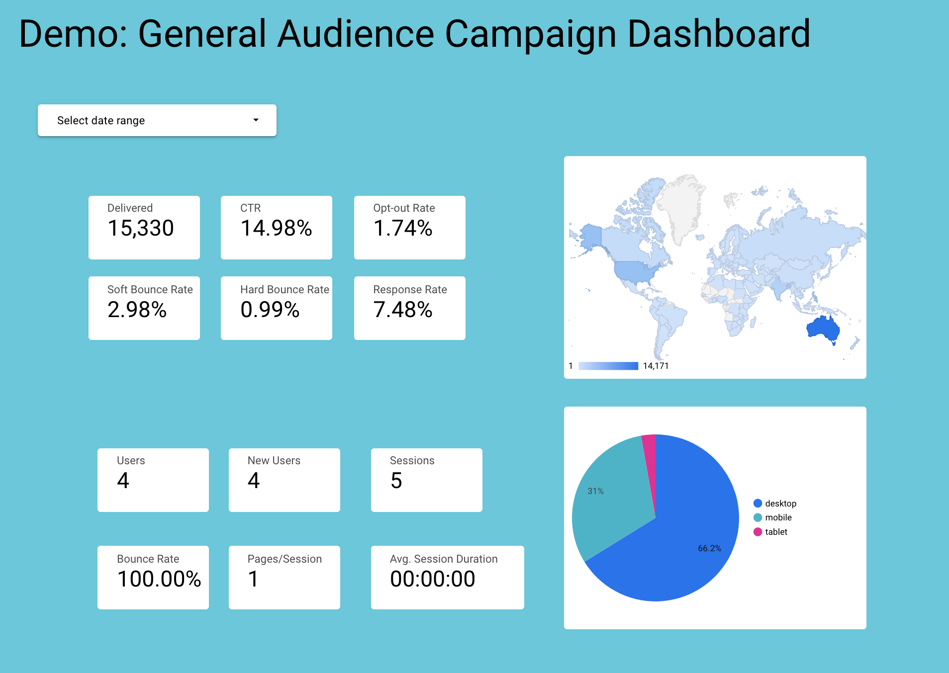
In this 3-part series we will be showing you how to create and customise a simple dashboard
Here’s a sneak peak of the final form of our dashboard, and yes you will be building that!

Part 2 of our Google Data Studio series will be focused on connecting your Burst SMS campaign data to your dashboard. Lastly, we’ll finish up this series with Part 3, where we’ll help you connect your Google Analytics data. Stay tuned for this in-depth tutorial!


